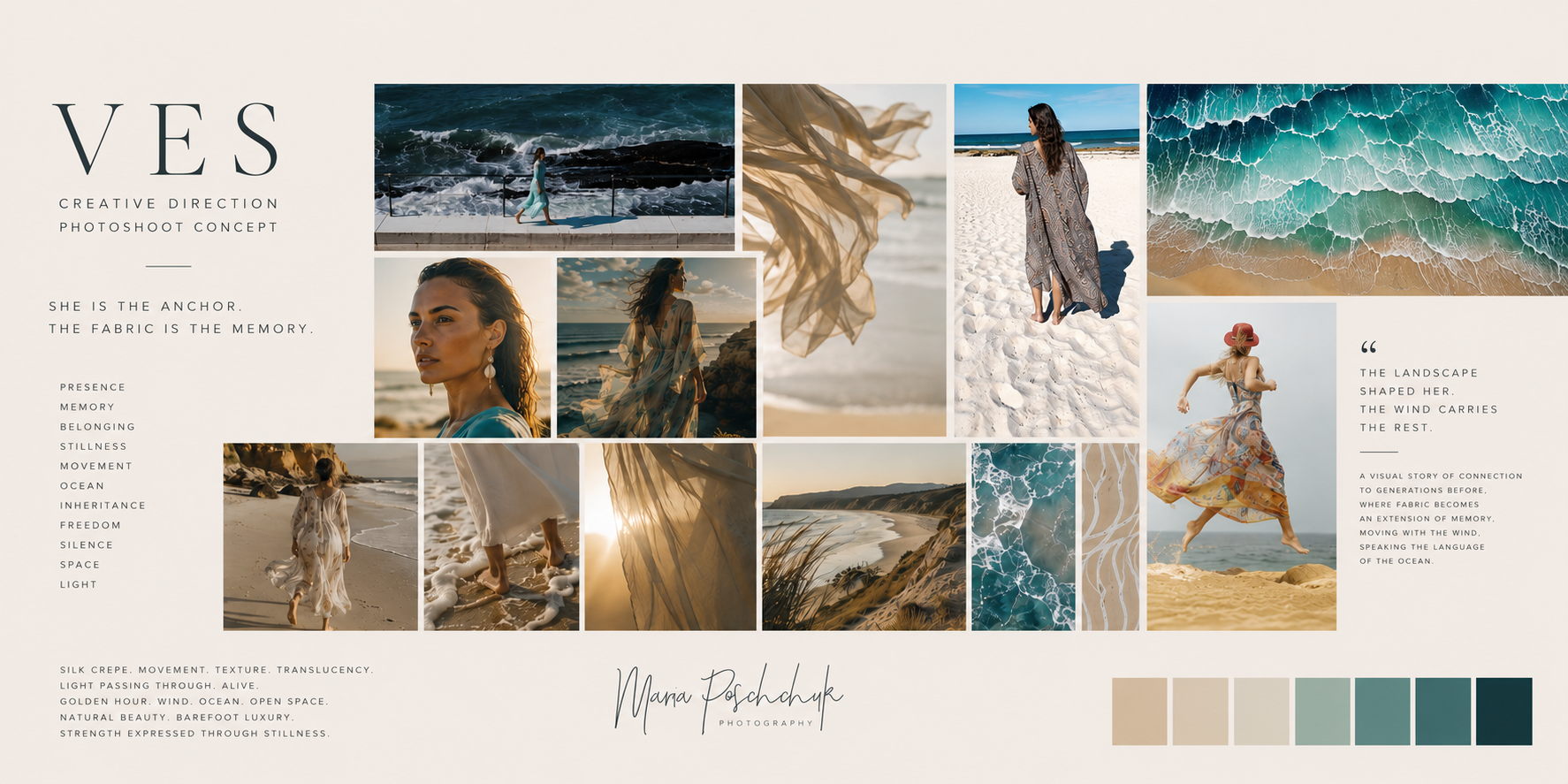
This independent creative proposal was developed after researching the visual identity and storytelling of Van Ermel Scherer. The project explores how its existing visual language could evolve through photography and motion. The objective was to create a campaign built around emotion, movement and connection to the Australian landscape while remaining respectful of the brand’s established identity.
This is a concept study and is not an official campaign.
Understanding the Brand DNA
Quiet luxury
Australian coastline
Connection to Country
Timeless femininity
Every campaign begins long before the camera is picked up. Before building the visual concept or selecting a location, I spend time understanding the brand beyond its products. I look at its history, values, visual identity and the emotional story it carries.
For Van Ermel Scherer, I explored interviews with founder Verity Van Ermel Scherer, the brand’s website, Australian Fashion Week coverage and the story behind the Mattie collection. What immediately stood out was that VES is not simply a luxury swim and resortwear label. It is a brand built on memory, identity and cultural continuity. At its heart is a deeply personal story — a tribute to Verity’s grandmother, Valerie Van Ermel Scherer (Mattie Frith), a proud Larrakia woman and survivor of the Stolen Generations. Rather than presenting garments as fashion objects, VES uses clothing as a vessel for memory, resilience and connection to Country.
The more I researched, the more it became clear that the garments themselves were only part of the narrative. Silk, movement, water and landscape all carry equal weight. The ocean is not merely a beautiful backdrop; it represents ancestry, belonging and continuity. The flowing silk crepe kaftans echo this relationship through movement, texture and light.
Another defining characteristic of VES is its understanding of luxury. It is not expressed through excess or ornamentation, but through craftsmanship, limited-edition textiles, meaningful storytelling and timeless design. Every collection is intentionally created to outlive seasonal trends, allowing garments to become part of the wearer’s own story.
This understanding became the foundation of the creative concept. Rather than producing a traditional fashion campaign focused on styling alone, I wanted to develop a visual narrative that honours the emotional depth already embedded within the brand. The objective was not to reinterpret VES, but to translate its existing values into cinematic photography and motion while remaining respectful of its cultural foundations.
The creative direction that follows is a response to that research.
Creative Direction
Luxury today is no longer defined by excess. It is found in space. In silence. In the feeling of belonging. The woman is not presented as a fashion model. She becomes part of the landscape. The silk carries memory. The ocean carries time. The movement belongs equally to both.
What I keep seeing is a story about a woman who carries something within her — strength, memory, connection and heritage. A woman whose quiet confidence never needs to announce itself. A woman whose presence feels completely natural within the landscape. In this story, the woman is at the centre, but the fabric becomes an extension of her. Almost like a physical expression of memory. When she moves, the fabric moves with her. When she stops, the fabric continues for a few moments longer. As though it carries stories that existed before her.
I imagine the movement of the silk echoing the movement of the ocean — waves, wind and fabric all speaking the same visual language. The woman becomes the anchor. The fabric becomes the memory. Visually, I see a vast Australian coastline. Large cinematic landscapes where the figure occupies only a small part of the frame. Moments of her standing at the edge of the ocean, facing the horizon. Close details of waves breaking on the shore, bare feet moving through sand, fabric catching the wind. A visual conversation between nature and the garments.
There would also be quieter portrait moments. Not smiling. Not dramatic. Just calm, grounded confidence. The feeling of a woman who is completely at ease within herself and within the landscape around her.
Across all the imagery, the emotional thread would be the same: What is inherited can never be erased.
For the Signature Silk Crepe in particular, I’d love to focus on movement and light. Unlike satin, which relies on shine and reflection, silk crepe has such a beautiful texture and softness. I think it would look incredible backlit by the sun, with the fabric almost glowing from within as it moves through the air.
From a production perspective, we could capture both stills and motion, and potentially incorporate anamorphic lenses for selected sequences. They create a slightly more cinematic feel, with beautiful horizontal flares and a stronger sense of scale and atmosphere.
____________________________________________
This proposal demonstrates my approach to brand research and visual storytelling. Every concept begins with understanding the identity of the brand before developing imagery that feels authentic, emotionally engaging and commercially relevant.
Every brand has its own story, audience and visual language. While every creative direction is unique, my process is built around understanding those foundations before production begins.
Creative Process
Research → Strategy → Creative Direction → Photography → Motion → Delivery
Deliverables may include fashion photography, editorial imagery, campaign films, underwater photography and production coordination depending on the needs of the project.
Creative direction, photography and motion built around your brand’s identity.